Jack McCausland
Jack McCausland
Photography, Graphic Design, Media
My starting point for designing tea packaging? A name.
I know - from other tea companies - their name can influence the font, which will influence the design, which will then be the main genre for the packaging; and this is all very, very important, therefore, I thought the name and type face would be a good starting point from, the research I've done.
As I was looking at succesful logos, on businesses and tea packaging, I quickly learnt that the most powerful two things, which effects the reputation, feelings, and presentation of a product, depends on colour, and type face.
A sleek type face, could make all the difference, weather it's worth the money or not (in the customer's opinion).
I knew I wanted something minimalist, something neat, simple, and also a play on words.
Some names I noted down, which I quite liked,
were:
QualiTEA
TimeForTea / Time4T
Leaf / Leafs.
QualiTEA.
This name grew and grew on me. It was a slight play on words, and suggested that the tea product was high in quality (which the brief stated it must be), and which I wanted it to be. I then thought, that this might've been quite a clique thing to do, therefore hesitated on the idea, and searched for other possible names.
I had a look at several different logos which I - along with the mainstream audience - love, and without a doubt, were very succesful.
I started off by looking at the Apple logo.
it goes without saying, but apples logo is by far the beautiful-est, simplist, effective and succesful of them all. As i looked in how the logo was crafted, I understand how and why it's so beautlfiul. As everylogo should, it's mathematically and geometrically pleasing and easy to the eye.
The thought of seeing a simple shape and instantly knowing what it is, who it is and what they do, never seemed to be possible to me, until apple came out with this beauty . (obviously I wasn't around during it's launch).
Although apples first logo wasn't as good, the way the design progressed and evolved with the nowadays technology, and kept up to date is increadible. I honestly can't wait if there is ever another re-brand. I doubt there will be. Goes without saying, by far my favourite logo (in a non-biased way).
FedEx.
Another great example of an ingenius use of negative space. Unknown to Lindon Leader (creator of FedEx logo) at the time, but as he started to move the lettering together, and arrow appeared bettween the E and the X.
The complete convienience of this happening couldn't have been better, considering that FedEx, as deslivery service moving from A to B, an arrow is a perfect coinsidence. It just proves that not all succesful logos have had endless amounts of thoughts and peperation into it - although I am sure a lot of hard work went into this - yet some people just have some great luck! It can go both ways in the designing industry.

As a little exercise in a session talking about logos, and the importance of it being easily re created by other clients or networks. We were asked to produce a made-up company and make a logo with pricise instructions, so they - alone, with no help - could reproduce it.
Instead of giving instructions, I decided to provide 'specs' of certain objects, such as text, or boxes, whether this might be colour, size, or positioning.
The end resault - for the other person - was identical to my original copy. Therefore, I think I succesfully made a document for re-creating a logo to the mm.
In most cases, this should also includ diagrams and explinations on what NOT to do with the logo, whether it's changing, adding, and taking something away from the logo.
Most businesses would want the exact font, colour, etc...

I then went onto making some questionnaires to collect infomation on what people prefer, in ways of tea bags designs, giving / recieving gifts, and tea in general.
I made two for two different perposes and audiences. One for tea designs - rating other popular designs and explain why - which was for any age or gender. But the other survey was specifically for the 20 - 35 year old margin (which is mentioned in the breif) asking about what they would prefer to give / recieve as a gift, and if tea, what kind of tea, how expensive, and all of that sort.
I made these questions to get a better idea on where I should go towards, and what will appeal more to the chosen audience as a gift.
The advantages of a survey is that you can get direct answers from questions you have asked them directly - opposed to looking it up on the internet and putting together an answer from lots of different points of infomation. This is also a method of primary research, meaning that as I have collected it myself, it will be true and relevent to my chosen topic, again, unlike most of the stuff on the internet.
However, this can take quite a long time, deciding carefully on the type of questions you'll ask, and why you need to ask these.
This also means asking people you may not know to get best - non biased - resaults.
On the other hand, these resaults can be mostely accurate and rewarding.

One of the two surveys I made and gathered infomation from, was to look into how people would react to different packaging. This survey helped me understand what my audience - 20 to 35 year old - prefers in terms of packaging, which would give me a clearer idea on what could make them more open to the idea of buying a tea set for a gift for someone.
My first question was simple, what tea packaging do you prefer more / less, and why?
Instantly, from the feedback I got from this question, I got the exact responce I was expecting. The one which came first most offen was number 1. They liked these products becasue it was fun, arty, not mainstream, yet still kept the classy, clean look. They also thought the illistrations were brilliant, and humerous. This package was described - from the survey - as 'exotic', yet 'simple'.
I agree with what these people said in the survey, this tea packaging was also my favourite, and I would like to include something looking quite similar to this, but with my own little twist on it.
On the other hand, within the four different packaging to chose from, I added one, mainstream, every day tea. This also got the exact reactions I was expecting. This package got rated the 'worst' looking one of all four, by all of my guests. Although this isn't as appealing as the others, it's important to realise that this is probably considerably cheaper than the others, and is less 'exotic', but is more safe, and more, every day. This gave me an idea of where not to go, and what my designs shouldn't look like, as this is a high class tea selection, not an everyday tea pack of 100.
This last packaging - the Twinings Everyday tea - was described as 'boring, original, and safe'.
From this, I will probably look towards my tea packaging clean, classy, and simple, and try not to use cheep looking fonts, types, colours and logos. I know that everything that I put on this package will be judged, on weather it's worth the money or not, high quality, or sold in bulk, so I know it's important to get it right first time.
The feed back I got from the surveys, gave me a clearer idea on what might be more succesful, what might look better, and more worth the money.
It was clear that I wanted something sharp, formaly dressed, and graphic.
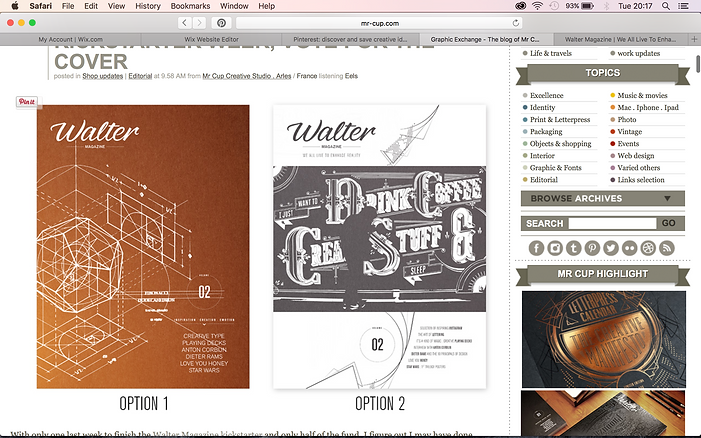
I came across these packaging designs on Pinterest, and simply fell in love with it. It was exactly what I was imagining.
As I stared to bring ideas and sketches together, the idea of having a map included within the packagaing - one way or another - grew on me. This meant that I could have different tea flavours for different countries, and have these different countries mapped on the packaging, depending on where it came from.
These designs - from www.Mr-Cup.com - are one of many facinating designs. I had a look at a few other designs created by this company and every single one of them were amazing.
The designer behind all these creations is Fabien Barral.
Fabien is a world-wide freelance designer, he creates his own personal collections, such as letterpress, calendars, coasters and business cards but mostely known for his client work.
The work he does for clients are described as 'unique' and 'innovative' by the businesses he does work for.
Although I really like his work in general, and what he creates, I feel that - with an expeption of this one piece (to the left) - his work isn't exactly clean, bright, and minimalist. Of course it'll change from client to client, but his work is more of what I'd call, a fine, classy, art deco.
Although I really like this style, I feel like I would find it really hard, and this isn't something I'd be able to re create, or even try to replicate. I took some of these products he's created as inspiration towards my own final piece, and set to create.

Some creations on his blog are also really inspiring, and more of a simplistic genre.
Although I'd like something quite clean, these designs really take an interest in me. However, I don't think these will influence my final design hugelly, as this isn't realy something you might find on a high quality tea packaging, and it's not something I've done before either.

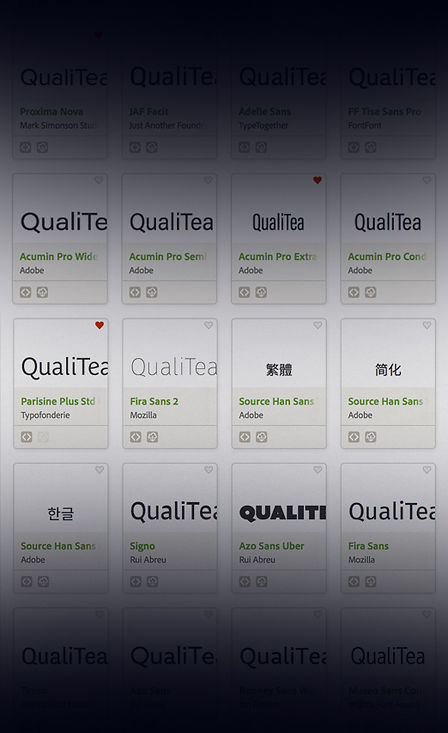
After scolling trough lot's of different fonts on TypeKit, I came across quite a lot of really nice fonts, which went with the type 'QualiTEA' really well.
I ended up chosing - as a first generation logo - the type face of FF Tisa Sans. I feel that this really kept the basics of what a font of a company supplying tea, and a gernal logo, should have. It's bold, it's got a slight soft, swirly side to it, and is quite gental to the eye.
After playing around with this type face, I added a slight gradient to make the Quali stand away slightly from the Tea.
As I was designing this logo, I have this great idea of incorporating all three relevent things - Q, T, and a mug - but I wasn't quite sure how I'd put these together, as the ones I did put together, didn't look very good.
After lots of sketches and ideas, I put this logo together, which was exactly what I wanted. It works with different colours, and is everything I logo should be.

The other logo I made - without using typography - was my favourite. Althought the logo with the type, was easy to understand, and straight to the point, I really like the way the other graphic logo comes together, and hides points which are really relevent to my company, and product. The Q looking logo is made up of 3 things. A Q (Quali), a T (Tea), and also looks like a mug from a birds eye view. I was really exited as this all came together, and worked really well on all medias and sizes, whether it's 1 cm x 1cm, or 1 m x 1m.
As a class session, I presented these two logos and introduced these to the class to recieve feedback, and pointers to where I could develop my logo / logos for completion.
With feedback from the group, we decided that I should give it a go with merging logos together, and replacing the graphic logo with the Q, and removing the e and the a out of TEA.
I did these points and I thought the logo looked alright. I wasn't quite how I thought it would come out, but it gave me the flexibility to you this logo, on a bigger scale, but when I want to print the logo out small, I could just have the Q, and leave out the other letters.
Now I have finished my logo, and have a rough idea of what I want my finished product to look like, I started scteching rough ideas on how I want my nets to look like and what the end product will hopefully look like.

The idea I had, was to have one large box, which contains a few smaller boxes - similar to size and design - which can contain different things.
This meant that it was fun, different, and also has the quality to be kept on the work space in the kitchen. I wanted this product to be as higher quality as possible, and made in a way which means it could be used again, after the product has finished, this means that it is eco friendly. making this product so it's either re-usable or / and recyclable is a must, becasue this means that the person who recieves this gift, can use it for something else, instead of just a tea package.
I started off by sketching out this idea of four, long but small, containers, fitting into one larger box. I had the idea of these four different containers can either contain different flavours of teas, or something slightly different, like buicuits, or something else which might be relevent to this product.
Having containers like this could make it easily re usable, and encourage the buyers to keep it to store things in, instead of throwing it away. Just incase the customer came to chucking it away, I'd want the material to be something which is either recycable, or biodagradible.
When looking out for inspiration, across the super markets, I came across this Siki Tea Gift Set. I wasn't quite sure what was in it, or what it involved, but I liked the idea of one large box containing 2 different flavours of tea, and one large tea pot.
I thought this would be really good to include something other than different flavours within the packaging, something which could litterally be kept for ever, like a kettle, mug, glasses, or tea pot.
I also really liked the material that was used here. The cardboard was all stylish, reusable, sustainable, simple, and ecofriendly. I would really like to use this material for my final design, but printing on this isn't an option for the equipment I've got, so I will just stick with some thick card.
I also like the illustrations and type used on this packaging. I might try and do some of my own illustrations, such as tea pots to go on each box, depending on what the box is.


I started going in depth in what I might want to carry on designing, and I went with a design something along the lines of this. I wanted to create a large box which could fit on any type of work surface in the kitchen. After lot's of thought, I decided to include 4 small boxes - containing different tea flavours or genres - and one larger box, containing either a tea pot or some cups / mugs.
This meant that I had a range of different products in one. Anyone could just buy some tea anywhere, but by adding another product in this, seperated my product from normal, everyday tea on the supermarket shelves.


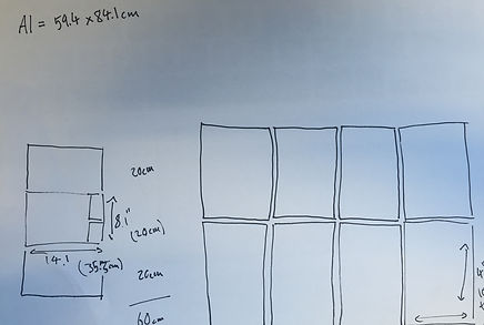
I then sletched out all the different nets I thought could make up my product. I started with thinking about how big I might want to end product to be, and I thought 20 cm high, and roughly 40 cm wide would be perfect to place upon a work surface, without getting in the way, yet be enough room to fit some mugs and pleanty of different flavours of tea in side.
After designing the largr box - which will contain the other - I then moved on to making the nets for the smaller boxes. I knew I wanted all of this to be equal, so I divided 35 cm by 4 to give the width of each box, so it'd fit perfectly, and exactly the same again, but 20 cm (hight of big bos) by 2 (number of rows). So I then knew that all 4 smaller boxes had to be 8.8 x 10 cm to fit perfectly.
The larger box how ever, will take up the other half of the larger box, so will be equivelant to 4 smaller boxes, as shown.

Once I had the outside packaging of the tea sorted, I went onto thinking of how I could present the tea bag it's self. I don't think I would like the change the tea bag it's self in any way, as this could prevent it being a practical shape or size for it to actually function, and also, you can't get more classy than a nice, fixed, rectanular shape.
I looked into how high quality tea show case their tea bags, and how it can be changed, or designed.
Straight away, I saw the common theme through out high quality, bagged, tea.


I really liked the idea of having a sleve / pocket to contain the tea bag, and a tag with similar colours and fonts. I think it really links it all together, and keeps Pukka Tea, Pukka.
I think this also gives the idea of each tea bag being precious, and carefully made indervidually, rather than it being made in bulk. I feel that having one single tea bag in one pocket - which could possibly be transported, alone, without the packaging - really says a lot about the product and the tea bag it's self, so I tried making some my self, and experitmenting with colours associating with different flavours.

