Jack McCausland
Typography
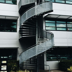
In buildings
 A | 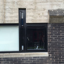 B |  C |
|---|---|---|
 D |  E |  F |
 G |  H |  I |
 J |  K | 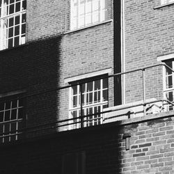 L |
 M |  N |  O |
 P |  Q |  T |
 S |  T |  U |
 V |  W |  X |
 Y |  Z |
Typography
Made with light trails
 A |  B |  C |
|---|---|---|
 D |  E |  F |
 G |  H |  I |
 J |  K |  L |
 M | 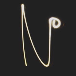 N |  O |
 P |  Q |  R |
 S |  T |  U |
 V |  W |  X |
 Y |  Z |
Typography
Nature
 T |  Y |  B |
|---|---|---|
 I |  O |  W |
 V |
EXPLORING TYPOGRAPHY
And its settings
In this exercise, I explored the meanings of what kerning, tracking, and leading meant, and used these techniques and settings in my own writing.
Kerning -
Kerning is applied when the spaces in the letting is either too wide or too small. Increasing the Kern means that the two selected letters move nearer to eachother. Vice versa, if the kerning is decreased, the letters move away from each other.
Tracking -
Tracking is used when you want a less/more dense sentences or words. It spaces all of the letters out equaly.
Leading -
Leading is the distance bettween lines. If leading is decreased, the chosen lines (one above the other) comes nearer together. Vise versa for increasing the leading.
I used this setting most commonly throughout my experiment piece. Such as the numbers, the size of that font is quite bit, therefore had a huge white space imbetween it and the email adress, above it.
So i highlighted the number and the email adress, and decreased the tracking. This moved them together, and stoped when it looked clean, and fitted.

