top of page
Jack McCausland
Jack McCausland
Photography, Graphic Design, Media
CREATIVE REVIEW
On magazines and such...
I love reading Creative Review, and seeing whats new. So much inspiration for just one book. Besides that, everything in here is how I like to work, weather it's the stuff being written about, or the way they lay it out for the viewers to read. If I were a book... I'd be this book.
Creative Review is a monlthy magazine which explores the development within the creative industry; like adverts, packaging, design, archutecture and fashion. These are all visual arts, weather its for advertising perposes or not.
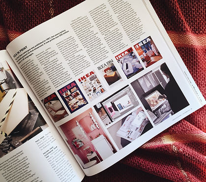

I love the way they've structured the colums, in many and thin lines. I think this looks really good, and keeps to the neat, and grid like lay out.
And the groovy, eye catching, and graphic front covers, which instantly explains what this episode is about that month.
I also really like the font they use, on the front cover, and the book. I think this goes along with the sleek, classy, and stylish theme of Creative Review.

There were quite a lot of interesting thing I saw in the magazine.
Even though some were adds from unis and colleges, they still carried on the groovy graphic theme (as they should do, considering this is an arts college).
I really liked this typogaraphy; bold, upper case type, with the yellow highlights. I feel that this really makes things stand out, and also looks very cool.
I think this is something I would like to use in my final piece.
bottom of page