Jack McCausland


Jack McCausland
Photography, Graphic Design, Media
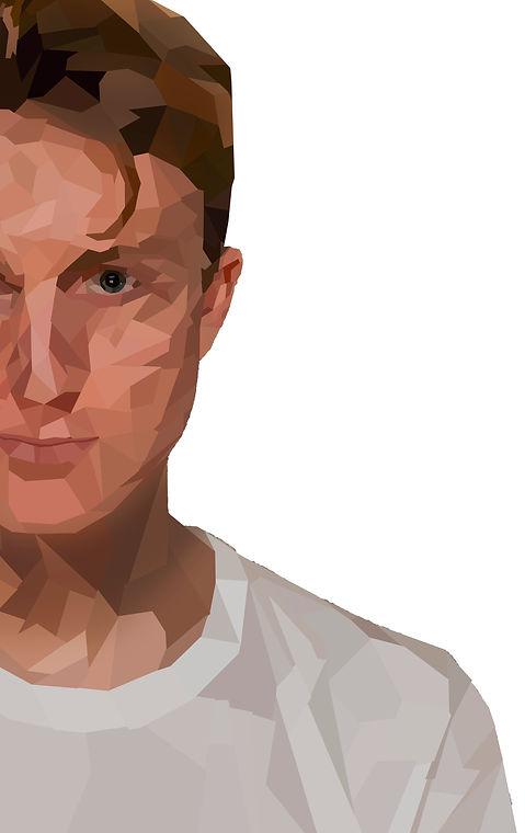
I made this poster, which advertises a (fake) graphic design exhibition which happens yearly. What inspired me to make something like this, was the really graphic designs on pintest, as shown. When I was thinking of a design for the poster I was planning on making, I wanted it to be very graphic, and minimalistic.
For it to be captivating of the eye, I envolved bright and dark colours, which contrasted acoringly. Also, I knew that having a profile on the photo, looking straight at the camera and making eye contact with the audience, would encourage people to look more into the poster.
I was aiming for the photo to cover most of the poster, and be the main aspect of the frame, therefore I included only half of the profile, which left more to the viewers imagination, and made it pleasing the the eye, as it fits with the 'rule of thirds'.
I started by removing the background of the photo, so I was left with what I would be working with, to get the end product.
To get this crystalised look, using the polygonal lasso tool, I roughly boxed off areas where there was a similar contrast and brightness, then selected a random colour within that space, and filled the whole box with it.
I did with different shapes, and sizes all across until I finished, to get a random, boxed, figure.
I really liked how this turned out. Something about the abstract shapes, all joined together, different shades of different coloured, come together to build something close to the original image.
In illustrator, I selected the fonts and colours I wanted to use.
I was looking for a faily 'industreal' and sharp font, to match the sharp and boxed image. After looking and comparing fonts, I chose to use Proxima Nova (Bold It.) and Time New Roman (It.)
I found that these two fonts really complimented each other, and gave a clean look over all.
The colours I chose (bright yellow and dark blue) are complete inverts of each other, therefore, go together really well.
I thought these two colours stood out, was easy to read, but also look great.
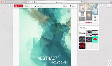


I came across a lot of images like these on the interenet, and really liked the way every one of them was formed.
I noticed that what ever shade or colour you pick out randomly, they're always linked in one way or another, and comes together to create an image just like the original, but ten times cooler.
I'm not sure where this effect came from, whether it originated from an artist, a certain era, or just a random guy, bored at his computer desk.