Jack McCausland
Jack McCausland
Photography, Graphic Design, Media
These nets are all my complete, final nets which I have prepared for printing out.
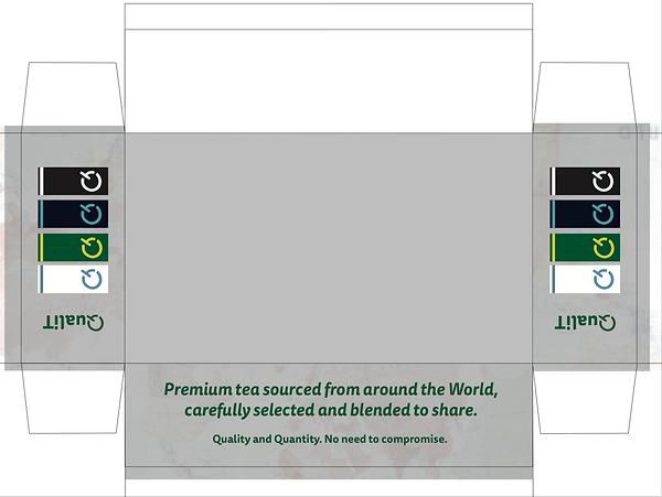
This first net is the largest net of all 6. It will be the one which contains all the other smaller boxes.
I designed this net so it'll come together and show off the inside boxes really well. I included features such as a dark background (to where it'll be showing) so it would frame the boxes inside better, and would draw more of the attention to the boxes opposed to the outside.
I also inluded tabs on my tabs, which meant I could fold them in, giving more of a higher quality, thicker, and more durable feel and look to the edge of the box.
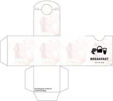
This is my second net design. This box is 4 times larger than the smaller boxes, and will take up half the amount of space in the larger box, containing all of them.
This box will contain tall glasses for two people.
I decided to include these things to seperate this from normal tea products that might be on the 'everyday' shopping list, and more of a gift.
This will also mean that this gift will provide something which can be kept for life, meaning it's better for the enviroment, and more efficient.


This is my second net design. This box is 4 times larger than the smaller boxes, and will take up half the amount of space in the larger box, containing all of them.
This box will contain tall glasses for two people.
I decided to include these things to seperate this from normal tea products that might be on the 'everyday' shopping list, and more of a gift.
This will also mean that this gift will provide something which can be kept for life.

I think that this box lay out will provide both the tea and glasses with good protection, and will mean the product itself wil keep a long time.
Having it made with quality in mind, means that it will last longer, the box could be used again after it's time, and also it's made out of fine, thick paper. Both of these point mean it's good for the enviroment, which is very important for the audience I am aiming at.

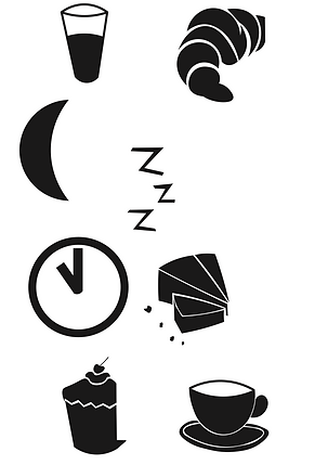


As I was creating these illustrations in illustrator, I was thinking how I could link the certain timing of the day and specific flavours, to things, objects and food with that specific timing (for example, glass of orange juice and crossaint for breakfast, morning tea, and a half moon and 'zzZZ's, conoting the evening, and night time).
As I was sketching them, I had the idea of IKEA's sketches in my head; how they linked the reason, flavours, or topic with objects, and also simplifying the object down to a point where little detail and understanding is needed.
Stripping an object right down to it's simplest form can be most effective, if done correctly. I think that I have done well in doing this, and although I would have liked to use colours more specific to my time of day, I had to use a monochrome pallet, as this would be the only option where it'd stand out against the slightly detailed, bright background.
I feel that IKEA's illistrations are just right. They're quirky, fun, and easy to understand.
The use of only black lines in this one above (although it is a colouring in page for children) I think is really effective, and could be great as a poster, or some other media).
Something over crowded in detail, especailly an illustration, can make all the different. On the other hand, something small and simple, can be the most effective way when capturing visual attention.
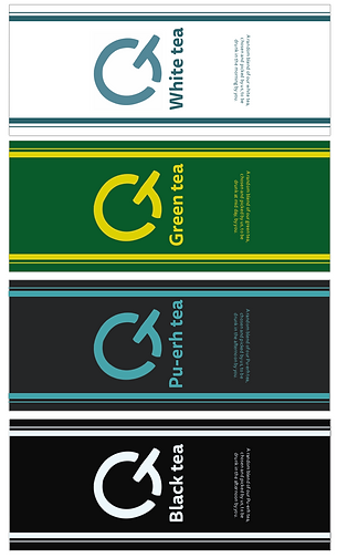

I decided to - instead of making an unusual shaped tea bag which would be hugely unpractical - I'd make a tag for the tea bag and a sleave for the tea to be kept and preserved in.
Although this is quite common, this is only used in high quality teas, and not something which you'd find in a packet of tea which is bulk, opposed to quality.
To make this different from other things similar to this, I made a range of flavours, linking colours and fonts with each pouch.
I feel that each colour - for the sleve and the tag - linked really well with the flavour of tea, and the time of the day of which it should be consumed (Dark colours as the day gets later, and bright, warm colours as the morning breaks).
