Jack McCausland
Jack McCausland
Photography, Graphic Design, Media

Plannings


Development

Onto photoshop


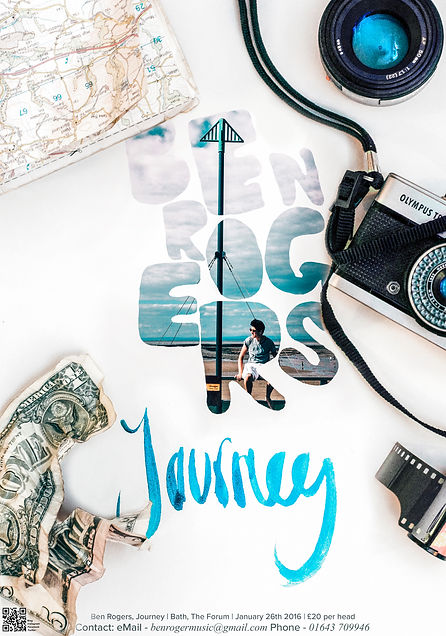
The idea:
I chose to select items which was relevent to traveling, as the topic, and ablum name was 'journey', and placed them onto a white background so I could then photoshop the original poster within this.
I thought this would give an over all look of what someones desk might look like while they're traveling, and put you in the image, which related to the subject of being on a journey.

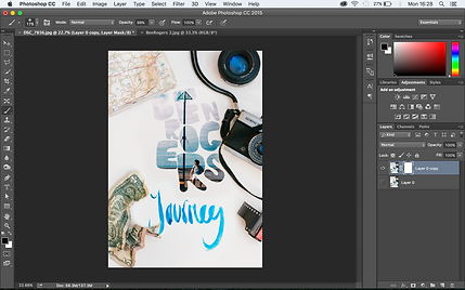
Once I finished layering, using layer masks, I decided to make it more 3D, which made it more realistic, and stand out more.

To do this, I removed - using a layer mask - the objects of which I wanted to apear with a shadow undernieth, so I could then burn where the object is near, without burning the object it's self.
This effect worked really well.

After I applied all of these effects, I then finished this over, with curve and colour adjustments, contrast, brightness, and also added a little bit of gain and clarity, just to make it all seem like it belongs to each other, and more 'realistic'.
I am really happy with the way this all turned out. The only improvements I would have liked to have made, was maybe apllying some more text or hand writing to fill the blank area to the left of the poster, with infomation such as website URL, although, I thought this would distroy the fact of it being quite a blank, minimalist piece, therefore I added a QR Code at the bottom left of the screen, which could link to the website, and other social media straight from the viewer's smartphone.